Showing posts with label Peter Thornton. Show all posts

Friday, August 12, 2016

Exploring Italic Calligraphy


I started learning Italic calligraphy through a Tutorial Program given by the Houston Calligraphy Guild (HCG) in 1999.  I had tried writing calligraphy on my own; I was OK but I wanted to get better.


The 6 month - 6 lesson - correspondence course randomly paired me with a teacher. I was lucky to have Fritzi Harry. She gave me encouragement and also let me know when I was faltering. 


I was given a detailed supply list: I had to write with a pen staff and a nib, no felt pens allowed! The 6 lessons included learning the basics of lower case: Minuscules - and upper case: Majuscules, ending with Design Principles and a final art piece using a minimum of 25 words.


I mailed my lesson to Fritzi and she mailed it back to me with a piece of tracing paper over my writing. She let me know where I succeeded and where I needed improvement. She even gave me gold stars!


We used this informative little textbook by Lloyd Reynolds. After 6 months I received a lovely Certificate at the September HCG meeting in 1999, written in Italic of course.

Practice and more practice
Through the years, I took other Italic hour-long workshops with the HCG. Recently I studied with Peter Thornton: Italic Variations at the annual calligraphy convention held in Dallas in 2014. I had fun learning how to loosen up after following the guidelines for many years!


If you want to learn Italic calligraphy, try it on your own first with the Lloyd Reynolds book, plus online courses, then find someone in person to share their experience with you about their hand lettering.


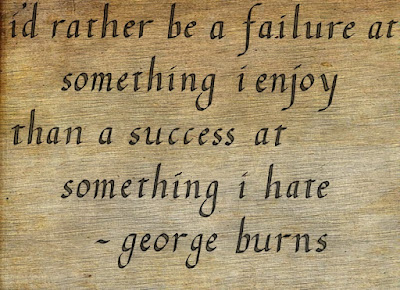
Please let me know how it works out for you. 

Friday, April 8, 2016

Creating Roman Lettering

©Anne Rita Taylor 2016


When I saw Roman letters I thought of capital letters I learned in elementary school. A famous example of Roman lettering comes from the inscription on Trajan’s column, a sculpted Rome pillar marking the triumph of the emperor Trajan (AD 98-117). 


I learned about Roman calligraphic rules by taking a Peter Thornton workshop several years ago. Each letter can be grouped according to its width. Below: Playing with Prismacolor pencils.


Starting with monoline letters is easier. Within a Parent Box, O and Q fill up the space. About 1/4 wider is the M & W. The C, D & G fill up 7/8 of the Parent Box. Then you have the letters that fill 3/4 of the Parent Box: A - H - K - N - T - U - V - X - Y - Z.


B - E - F - J - L - P - R - S fill 1/2 of the Parent Box. The letter "I" stands alone. And spacing between letters can take years of practice! Some say spacing between words is equal to the small letter “o” yet others say spacing is between the stems of the “H."


omans are necessary 


for my White Vine calligraphy click here: https://anneritataylor.blogspot.com/2016/03/creating-white-vine-letters.html also my Checkerboard calligraphy:  https://anneritataylor.blogspot.com/2016/02/coloring-checkerboard-calligraphy.html


Alternative ways to write variations of Roman capital letters are fun! 


Playing around with calligraphy placement.


Fun experimenting with different kinds of paper and ways of writing! Writing on Strathmore Parchment Paper and bouncing the letters, writing every other letter above the line, gives a certain lightness to a quote.


This is the book I made in Peter Thornton's class with my notes and calligraphy exercises.


I enjoy the practice of calligraphy! Please send me any questions in the Comments section.