Showing posts with label calligraphy. Show all posts

Friday, October 20, 2017

Easy Pencil Calligraphy

All pencil work except "City" as noted below, is artwork by Anne Rita Taylor, enhanced by filters.

Last Saturday I led a presentation at the Houston Calligraphy Guild with a few techniques from Amity Parks workshop at the Legacies II Calligraphy Conference in 2014, called Graphite Techniques. Graphite, otherwise known as pencil lead, is a mixture of carbon and clay, not lead.

The #2 pencil is considered 2B or an HB combination. A hard graphite results in a light grey - H for Hardness. Soft lead is darker, B for Blackness. 


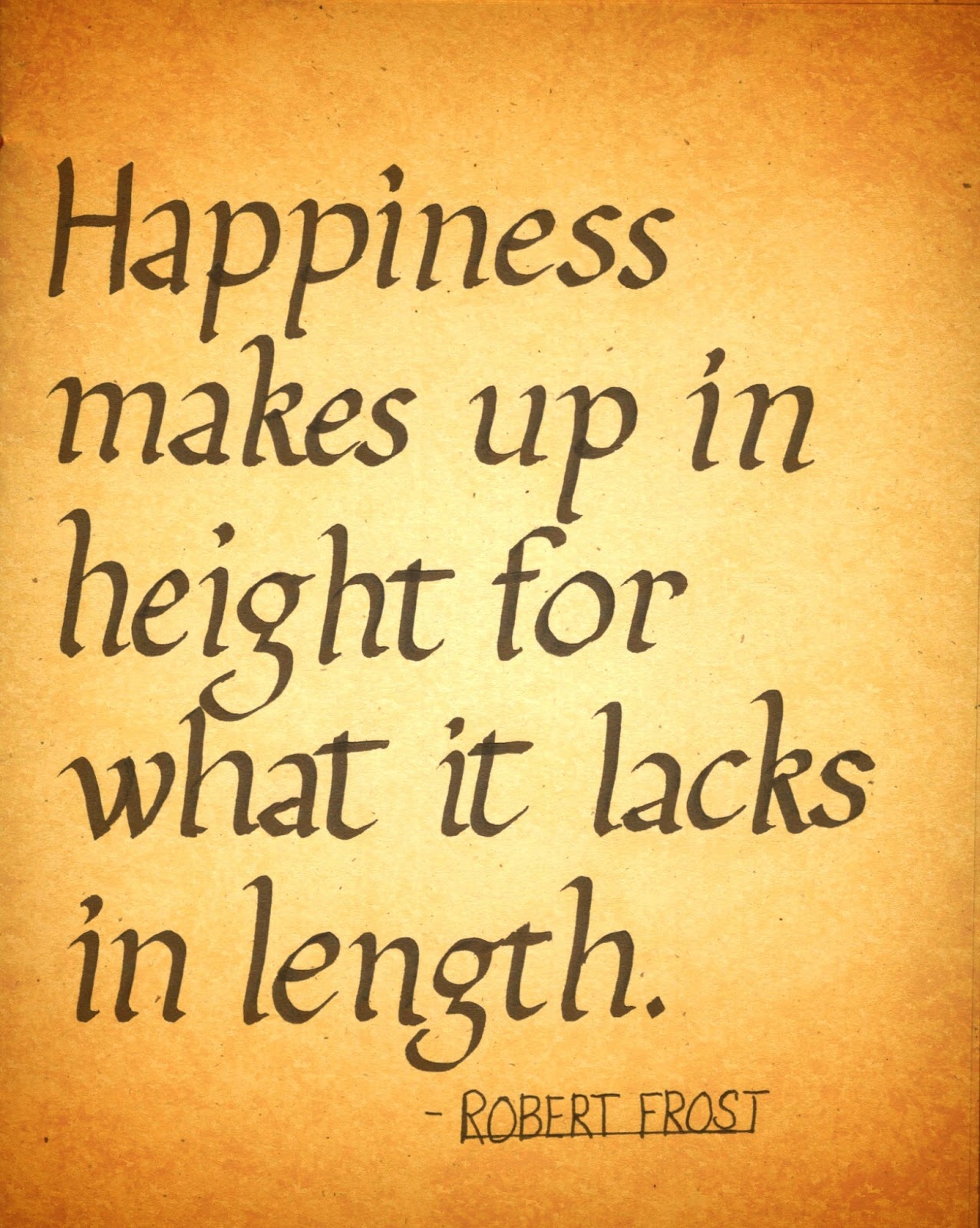
My handout has the four techniques I demonstrated. We started with drawing shades with any pencil, from light to dark. This is called the VALUE of a color, so you learn how to vary your pressure while using a pencil.


Next was an exercise for a Cross Contour, that makes words pop and look three dimensional as you can see on my handout with the words JOY and PLAY.


Two tables were set up for hands-on play: one with graphite sticks. You can cover a large area with graphite, then use an eraser to write into it. A famous artwork using powdered graphite is “City” by Ed Ruscha, made in 1967, held in The Broad, a contemporary art museum in Los Angeles. 


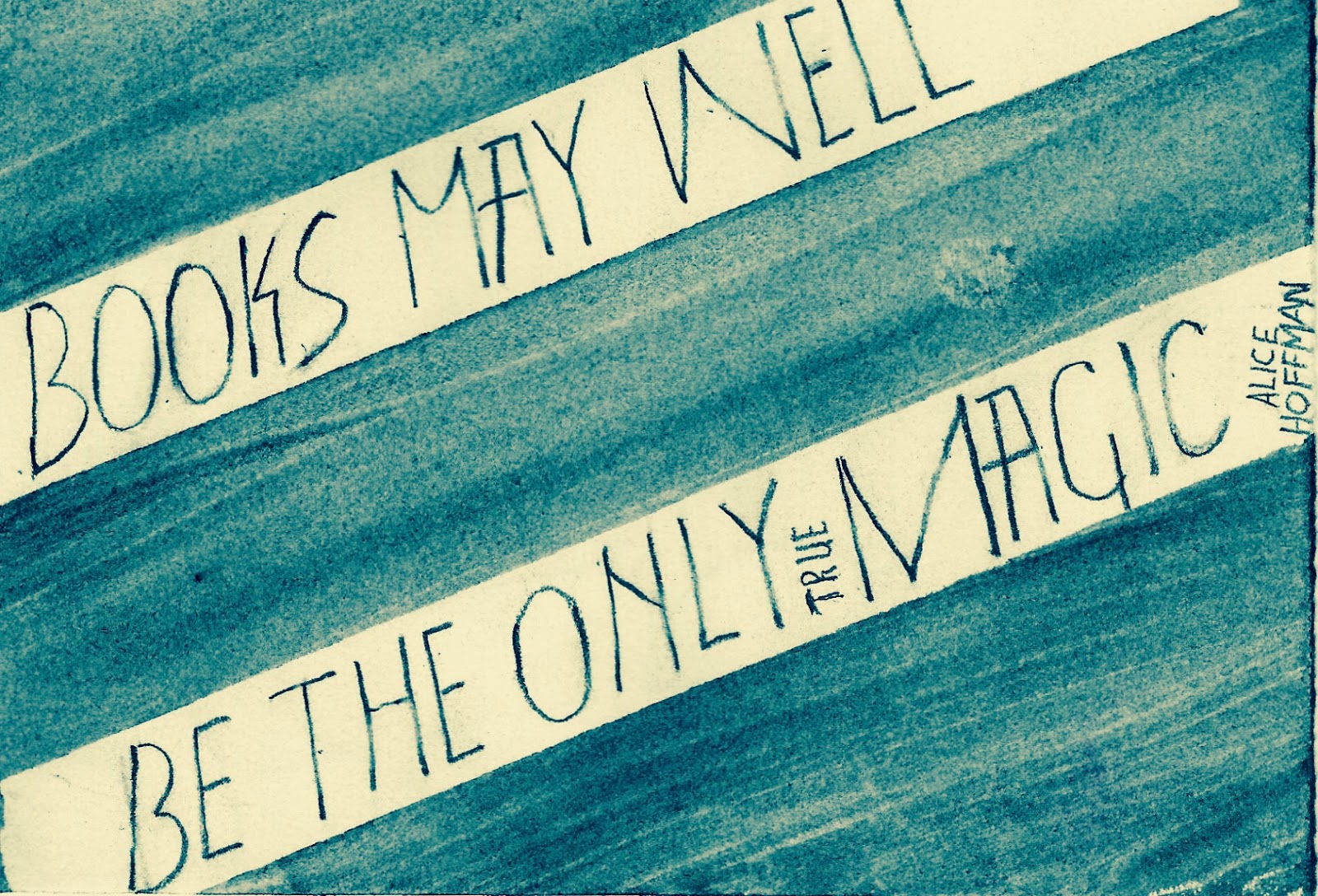
The other table had water-soluble graphite sticks. Also cover a large area, then write with a paintbrush wet with water. Or use the graphite as watercolor where I wrote: Believe, with the quote above.


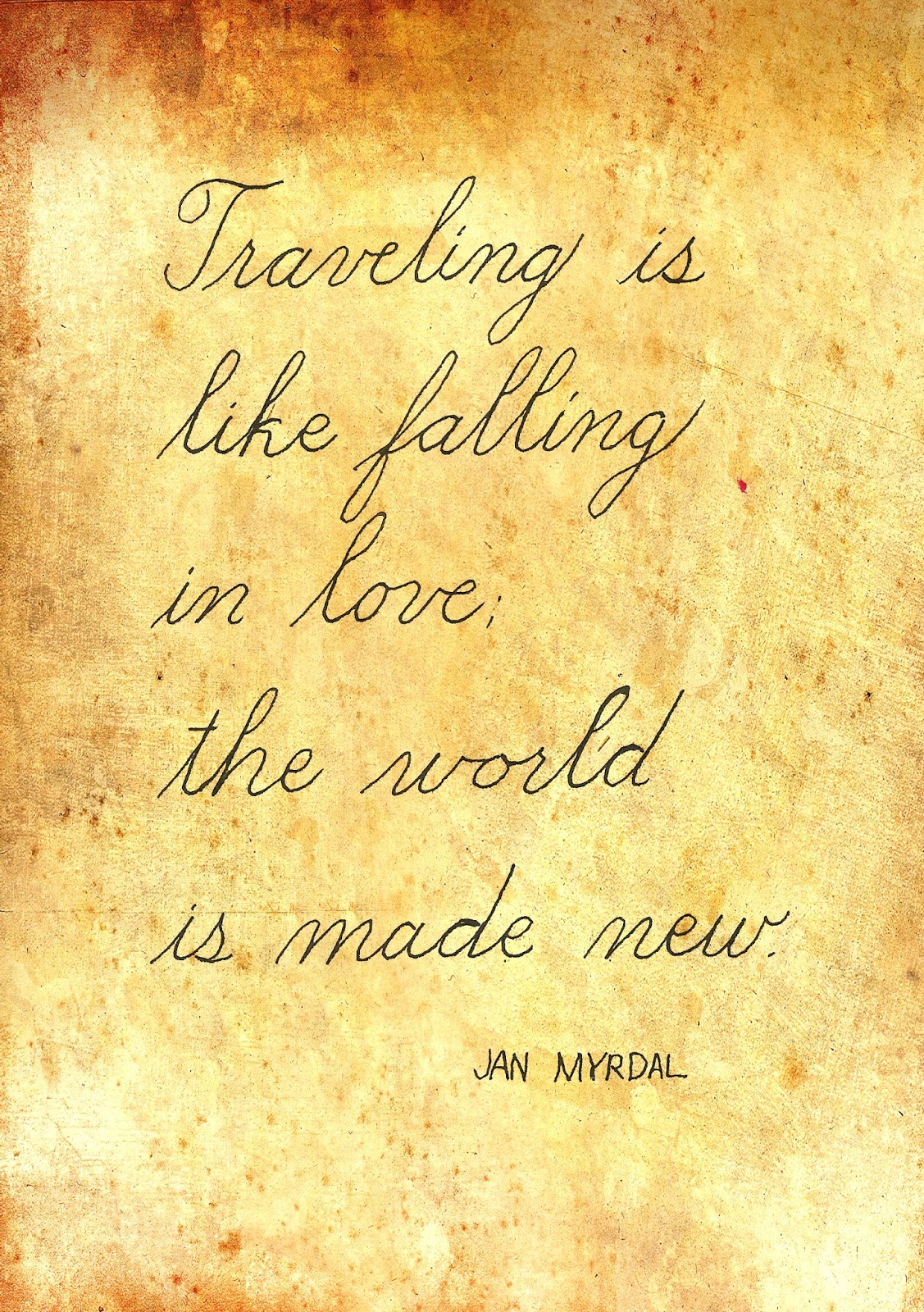
A big difference is graphite can be erased, but the water-soluble graphite cannot be erased as easily. Water-soluble graphite mixed with water is an ink wash, like painting with watercolor except it looks like pencil markings. Fun to spray water on a quote made with water soluble pencil, comes out like this:


All in all, I think 40 calligraphers enjoyed a few techniques I learned in Amity Parks workshop. And I can’t wait to take her next workshop in March when she comes to Houston to teach Mixed Media. What do you think about pencil calligraphy?


Varied my writing pressure using a #2 pencil, plus brushed on water soluble graphite.
©Anne Rita Taylor 2017

Friday, August 4, 2017

Learning Copperplate Calligraphy


Last year I took a class with a Houston calligrapher, Terry Hausner, to learn Copperplate calligraphy - wedding invitation calligraphy - also called English Roundhand. See Terry’s website: http://www.terrygraphicsink.com

My name on top written by Terry Hausner - on the bottom written by Heather Held

I have not practiced - I should if I want to get better at it. I also took a Spencerian calligraphy workshop with Michael Sull a while ago. See his Facebook page: 
https://www.facebook.com/MichaelRSull/
For me, Spencerian is a tiny bit easier since I do not have to write thicks and thins with ink, but there are more swirls which are called flourishes.


One of my many Copperplate practice pages. Terry taught us to write in various sizes, increasing and decreasing the dimensions of our written letters. I think smaller for this type of calligraphy is slightly easier for me. Plus the slant, when practiced against the slanting lines, made me realize what mistakes I was making.

I find it difficult to be light when making thin lines and then heavy by forcing the tines of the  nib into a thickness. In the class we started with learning how to hold an Oblique Penholder - I’m still learning. I prefer a staff.


Terry supplied many different nibs for us to try. As noted, I have a heavy hand when I write, so I need a nib that can withstand pressure. After much trial and error, I like to use the Nikko G and Zebra G, plus the Speedball 512 nib. 


I have written a form of Copperplate with a water soluble pencil, then sprayed it with water achieving a blurry effect as in the quote below: There is nothing else.


Like anything, the more we practice the better we get. I’m not a professional calligrapher for that reason, I do not practice enough. But I do enjoy writing as an end in itself. How do you feel about it?


And here is a photo of the many writing instruments used in calligraphy - shared on Facebook by Tom Lane - known as Ginger Monkey.  Find him on Facebook here: 
©Anne Rita Taylor 2017

Friday, May 19, 2017

Calligraphy at The Marriott


Every two years the Houston Calligraphy Guild reserves classrooms in the Marriott Westchase offering discount rates for over-nighters. I last attended in 2011 when I taught Zine-Making - see my prior blogs about Zines:
https://anneritataylor.blogspot.com/2016/10/publishing-zines.html
https://anneritataylor.blogspot.com/2016/11/writing-zines.html
https://anneritataylor.blogspot.com/2016/11/designing-zines.html
I attended the HCG Retreat last weekend & really enjoyed myself.


There were 9 classes (2 & 1/2 hours each) to choose from. Forty HCG members each picked 3 classes. Saturday morning I chose Journal Contour Drawing with Shirl Riccetti: http://www.shirlriccetti.com 
Shirl exhibits her drawings & watercolor art at the Archway Gallery in Houston.

My quick portrait of Shirl Riccetti - left / Lobby sketching - right

Shirl liked timed drawings of 2 and 3 minutes! First we drew a chair copying from an upside down drawing from Van Gogh - I liked that! We practiced outlining and filling in while copying from magazine photos. 


I loved using one of my Paris photos for a timed journaling exercise. Finishing up, we actually went out to the lobby & sketched - fun & daring.


My Saturday afternoon class was Pointed Pen Uncials taught by Cindy Haller, a talented local calligrapher for hire:
http://www.houstoncalligraphyguild.org/blog/cindy-haller.html 

The class was modeled after Michael Kecseg who was bringing this historical letterform into the 20th century. 


Cindy’s class would have been better for me if my bottled ink had not exploded in my art supply bag - ugh! Cindy suggested I use a pencil first and go over it with a monoline tool (no thicks or thins). I will practice these letterforms since done correctly, they are very pretty.


On Sunday morning I took J.B. Banzon’s class, another talented local calligrapher. This was his first time teaching and he was excellent! Snowflake Flourishing was lots of fun with attention to detail. How long ago had I used this compass!?!


On Friday evening we dined at a lovely French restaurant, La Madeleine. During the weekend the Marriott provided two breakfast buffets with yummy crispy bacon, and a fine lunch and dinner on Saturday. The cookies that afternoon were a treat! Plus I actually had two good nights of sleep. 


Saturday night there was a raffle for calligraphy prints from a legacy left by Helen Shinpaugh, a most beloved HCG member. I was lucky enough to win the print above by Mark Van Stone.


All in all it was a fun weekend of making art and being with my calligraphy tribe.
©Anne Rita Taylor 2017

Friday, February 3, 2017

Valentine Exchange


I joined a Valentine Exchange with The Guild of Book Workers - Lone Star Chapter - to send 10 Valentines and receive 10 in return. Rules included having an edition using any method of printmaking or paper or book arts.


I used my carvings for a photopolymer plate from Boxcar Press. As a member of The Houston Printers Guild I used The Printing Museum’s tabletop printing equipment & sold some of these cards in their gift shop.


For this exchange I added another dimension having an accordion book inside the card.


I found a quote I liked and practiced calligraphy so it would fit when folded in eighths on one third of an 8 1/2 by 11 inch scrapbook paper.


I attached the accordion with a heart shaped brad. Here is the inside and back of the card where I also attached my "Made by" labels.

I thought it actually needed something more…so I used my Sizzix Embossing Texture Boutique on all the card fronts. You can see the details:

Now let’s see what kind of Valentine cards I receive by February 14th. There will be an online exhibit on the Lone Star Chapter’s website: https://gbwlonestarchapter.wordpress.com


To finish I used a wonky heart I carved on each envelope. This month is all about LOVE!!!


If you feel the spirit move you, please leave me a comment. Happy Valentine's Day!
©Anne Rita Taylor 2017

Friday, December 30, 2016

Review 2016: Top 3 Posts

This is my 53rd post! I started this weekly blog on New Year’s Day 2016. The Unicorn Dream above posted in Creating White Vine Letters (5th most popular!) on March 4th. Click link: https://anneritataylor.blogspot.com/2016/03/creating-white-vine-letters.html


My top 3 popular posts: Blogger tells me how many times each blog is viewed - not including my views either.


Beaded Books is my #1 blog for 2016 - instructional & the most popular - posted on September 23rd. Click link:
https://anneritataylor.blogspot.com/2016/09/making-books-with-beads.html 


There are two 2nd most viewed posts: Bookbinding in Los Angeles - with Charlene Mathews posted on May 20th. Click link:
https://anneritataylor.blogspot.com/2016/05/bookbinding-in-los-angeles.html 
Plus: Carving Images for Prints - DIY posted on January 15th. Click link:
https://anneritataylor.blogspot.com/2016/01/carving-images-for-prints.html


3rd most popular is Marbling Suminagashi Style - also instructional posted on March 18th:
https://anneritataylor.blogspot.com/2016/03/marbling-suminagashi-style.html


The top calligraphy post - also about book binding -& my 4th most popular is Fabric Book of Intentions on February 19th: Click link: 
https://anneritataylor.blogspot.com/2016/02/fabric-book-of-intentions.html


I was on the Design Team for Arnold Grummer Paper Making: February through July. It was a happy experience - AG sent me free art supplies - what more could I ask!?!
My most popular post for AG is on July 27th. Click link:
http://arnoldgrummerpapermaking.blogspot.com/2016/07/window-zig-zag-book.html


If you read this far…  During 2017 my blog posts go twice a month - the 1st and 3rd Friday of the month - so I have more time for art-making. 
Here's hoping we all have a peaceful and rewarding Happy New Year!
©Anne Rita Taylor 2016

Friday, December 23, 2016

Learning Foundational Calligraphy


Lettering Foundational calligraphy seems easier because it is based on the circular O. Also of course it takes lots of practice!


Sheila Waters book, Foundations of Calligraphy is helpful; she has an analytic approach. Sheila studied at the Royal College of Art, London.


Because it was available in 1999, Italic was my first calligraphic hand, taught by The Houston Calligraphy Guild through their Tutorial Program. Simply put, Italic letters are narrow, written on a slant. Using a keystroke we can make anything we type Italic. See Exploring Italic Here: https://anneritataylor.blogspot.com/2016/08/exploring-italic-calligraphy.html


I tried learning Foundational on my own; then I benefited from a Summer Study class with Karla Hamilton: White Vine Letters and the Foundational Hand. 
See my blog on White Vine lettershttps://anneritataylor.blogspot.com/2016/03/creating-white-vine-letters.html


I practiced all summer, working toward this finished project. 


I have since enjoyed Foundational as my go-to hand but I know I am not perfect. What makes calligraphy so much fun is trying to master the form.


Practice, practice and more practice - fun on a winter's day... 


Below: I try writing using 4 pen nib widths for lower case and 7 nib widths for ascenders & capitals.


If you would like to share your thoughts with me - please let me know in the comments below.

Have a very Merry Christmas!!!


©Anne Rita Taylor 2016