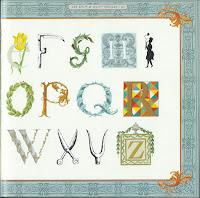
©Anne Rita Taylor 2016
In the Summer of 2013 I was thrilled to have an article I wrote published in the magazine, "Bound & Lettered" about book-making and calligraphy. In Volume 10, Number 4, sold through John Neal Books, most of what follows appeared in the article.
ortunately White Vine Letters are easier to make than they appear. Basically a Roman Capital overgrown with a vine. While the white vine resembles ivy, it is a stylized version of acanthus leaves which were used as a decorative motif as early as the 3rd century in a Roman mosaic floor. Also used in architecture in the Doge’s Palace in Venice during the Renaissance.
Even though this style of decoration can be seen in manuscripts coming out of monastic scriptoriums as early as the 9th century, it was not until the 15th century that the white vine initial letters were widely used, such as in the Book of Hours, circa 1406. The Roman capital was often in gold.
The upper left corner of the text block would have a white vine initial for the first letter of the first word in the paragraph. The position could change if the section or paragraph started in the middle of the page.
summer study program on illuminated manuscripts was my introduction to these initials with their intertwining vines. I was able to share my joy for these letters during a mini-workshop I taught for the Houston Calligraphy Guild in 2010.
When making these initials, you can carefully render the vines filling them with multiple flowers and leaves, or you can go for the more informal look in my examples.
- After you draw your one inch high Roman Capital letter in pencil, go over it with waterproof ink, let the ink dry, then erase the pencil lines. I use the Sakura Pigma Micron Pen - Size 01.
- Draw - lightly in pencil - a box around the letter with maybe a quarter inch of space on all sides.
- Draw a circular swirl (FIGURE 1) in pencil, more circle than oval for your main vine.
- Add shoots coming out of your vine (FIGURE 2)
- To give dimension to the vines, double the lines around the vines and shoots (FIGURE 3).
- Using your pencil, draw some buds and flowers at the end of the shoots, trying to get the buds and shoots to touch so you can add color (FIGURE 4).
- Go over your pencil ivy and outer box with the Micron 01 Pen. Erase pencil marks as needed. Then using only three colors: red, blue and green; or purple, pink and turquoise; or brown, orange and yellow; color in the spaces, alternating the colors so they are spaced evenly. Either watercolors or Prismacolor pencils work well depending on the quality of your paper.
- Optional - Color the inside of the Roman Capital letter in gold, either flat gold or metallic gold. Prismacolor pencil, metallic paint, or acrylic metallic ink work well in gold.
 |
| After my trip to Paris I colored these white vine letters for bookmarks. |


